
- Who: Department Of Veterans' Affairs - Open Arms
- Product: Business cards, poster, fridge magnets, t-shirts, banners, flyers, brochures, visual style guide
- Why: To provide material with support channels to veterans
- Activities: Visual design
- Tools: Photoshop, Illustrator, InDesign
- Role: Visual designer
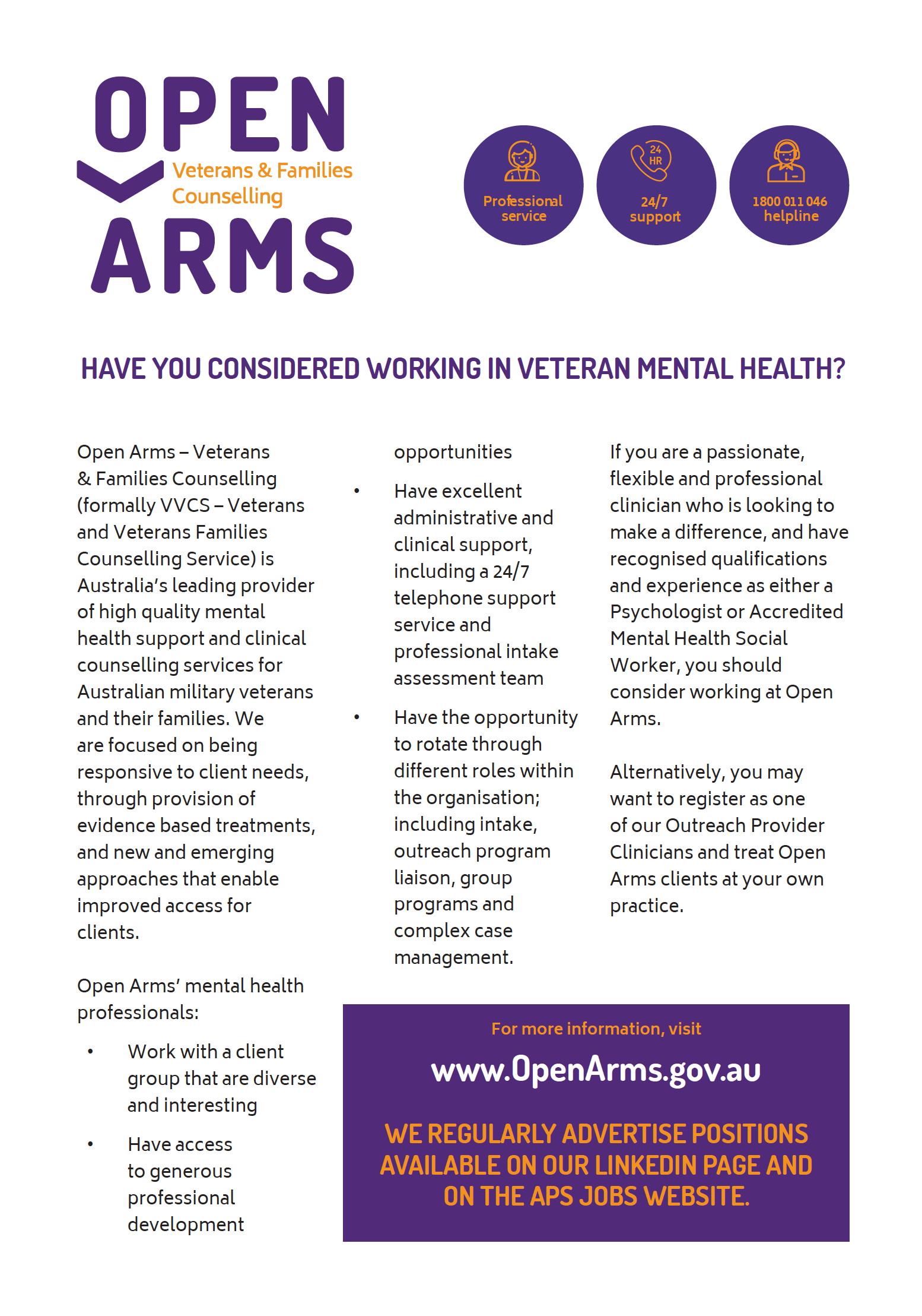
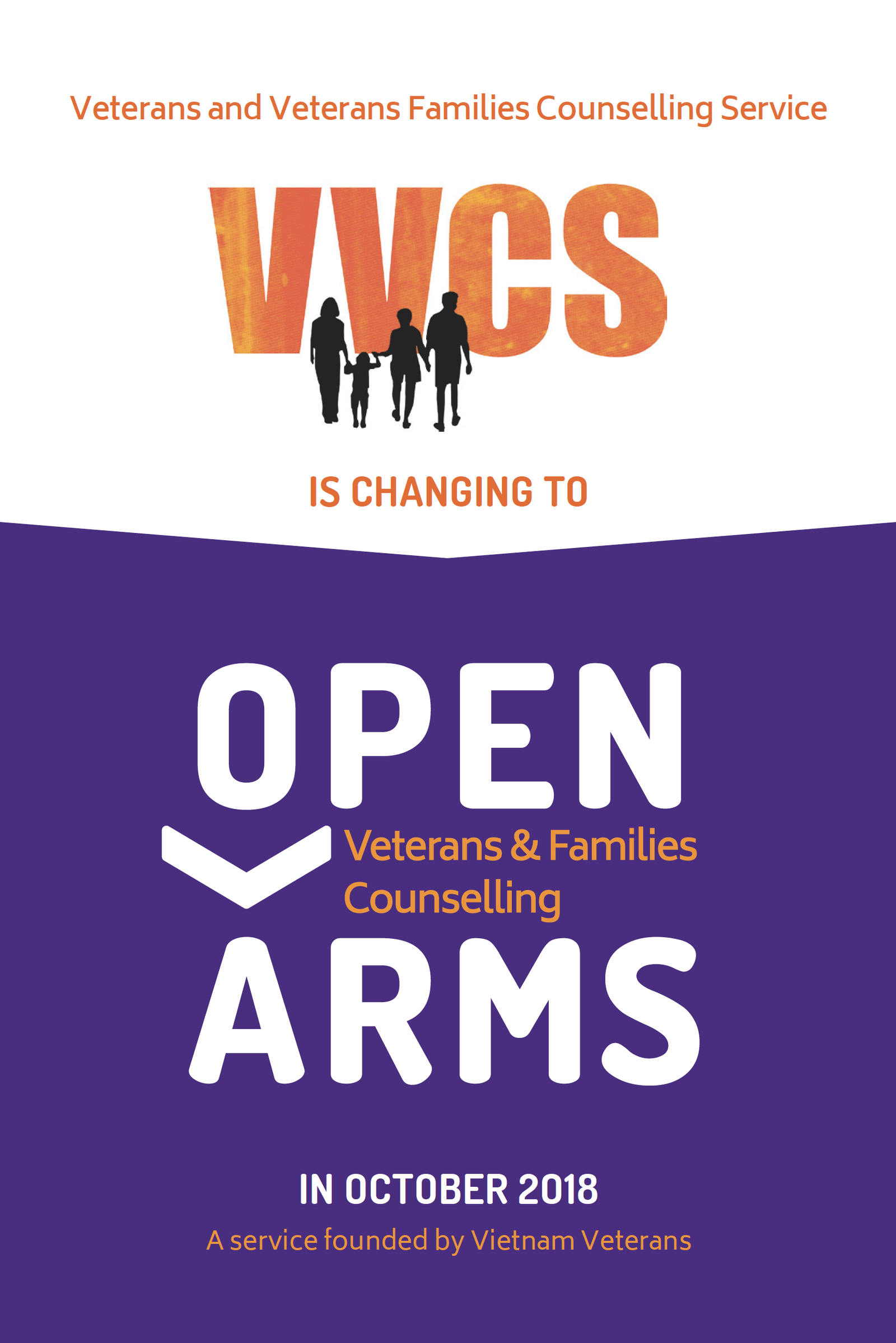
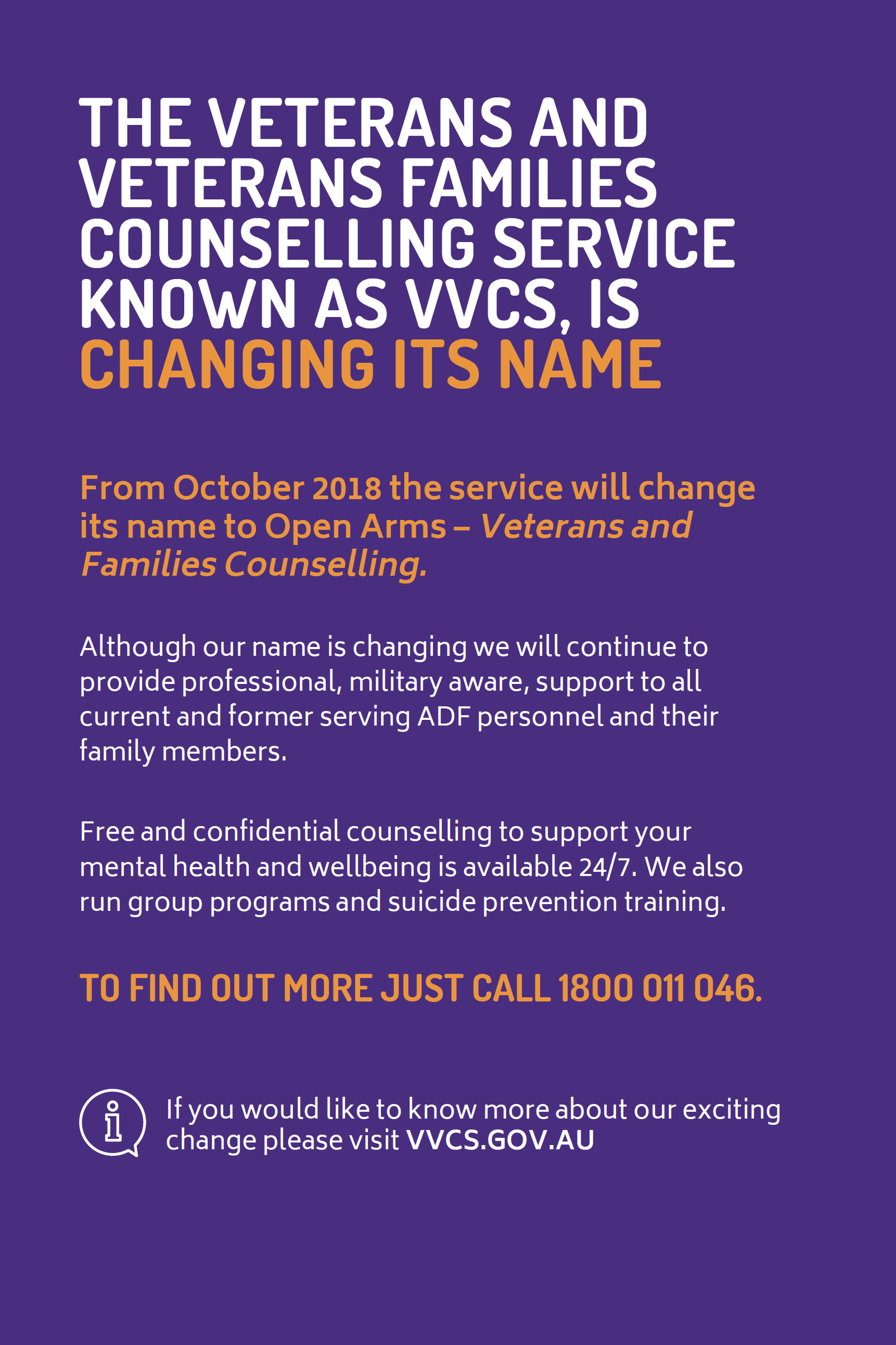
Open Arms, a branch of the Department of Veterans’ Affairs, was in the process of changing their name from VVCS.
In addition, they had a number of websites that were clearly out of date.
They needed their websites redesigned, their style guide updated, and a range of print materials produced.
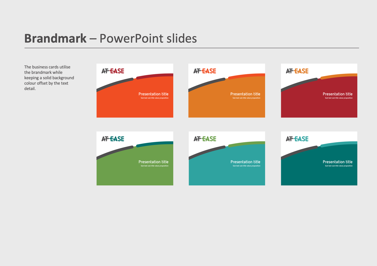
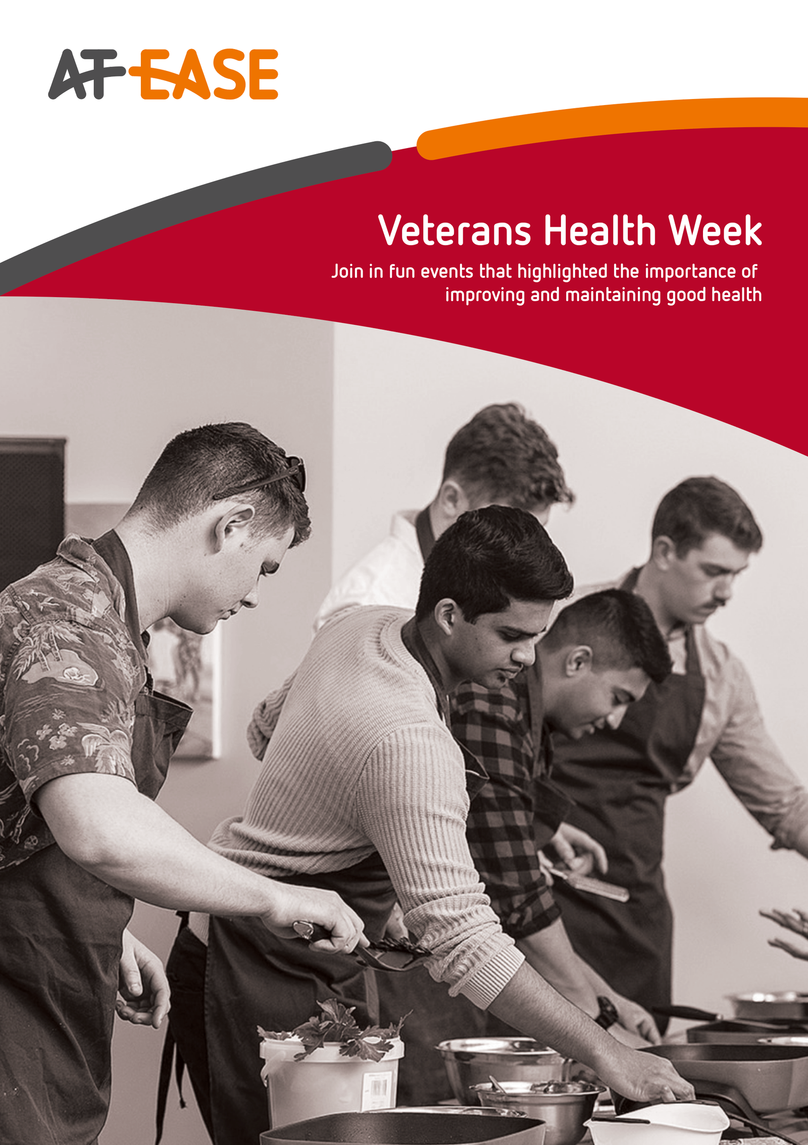
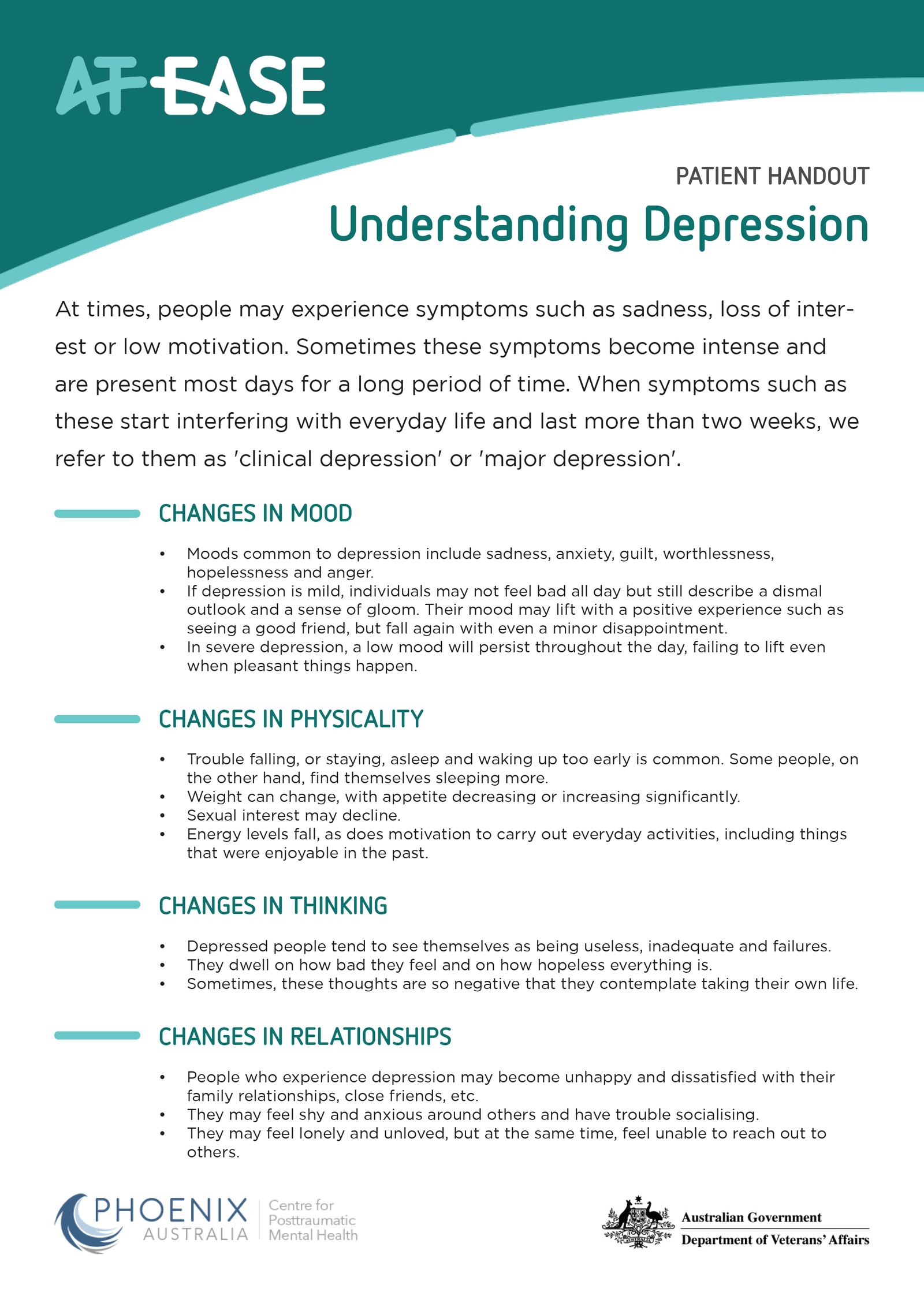
The new visual design style guide needed to be expanded, and a range of print materials needed to be developed including social media banners, street banners, fridge magnets, business cards, brochure covers and flyers.
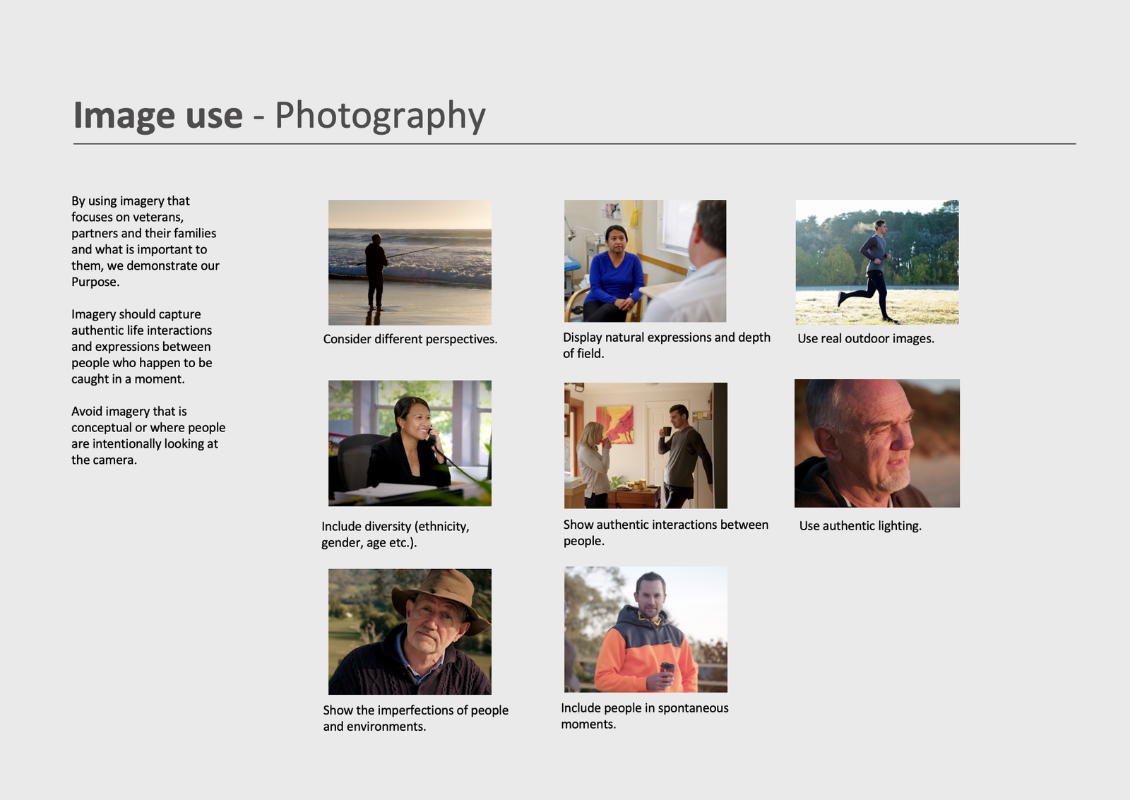
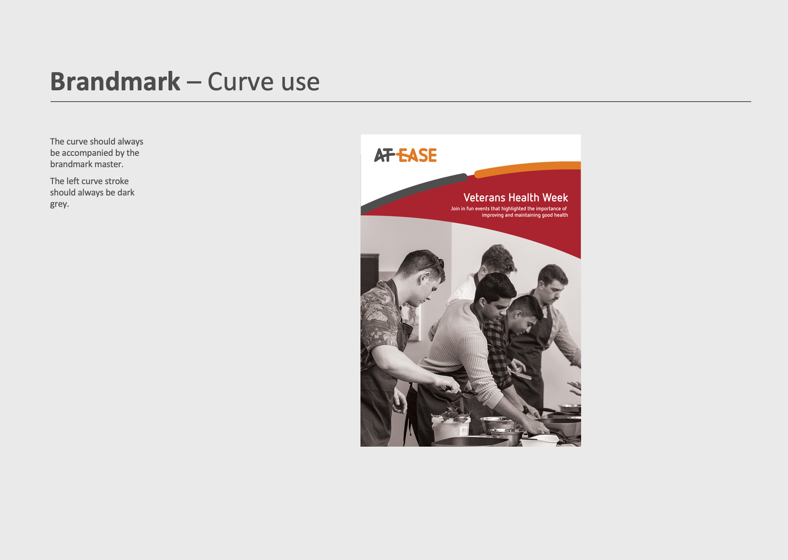
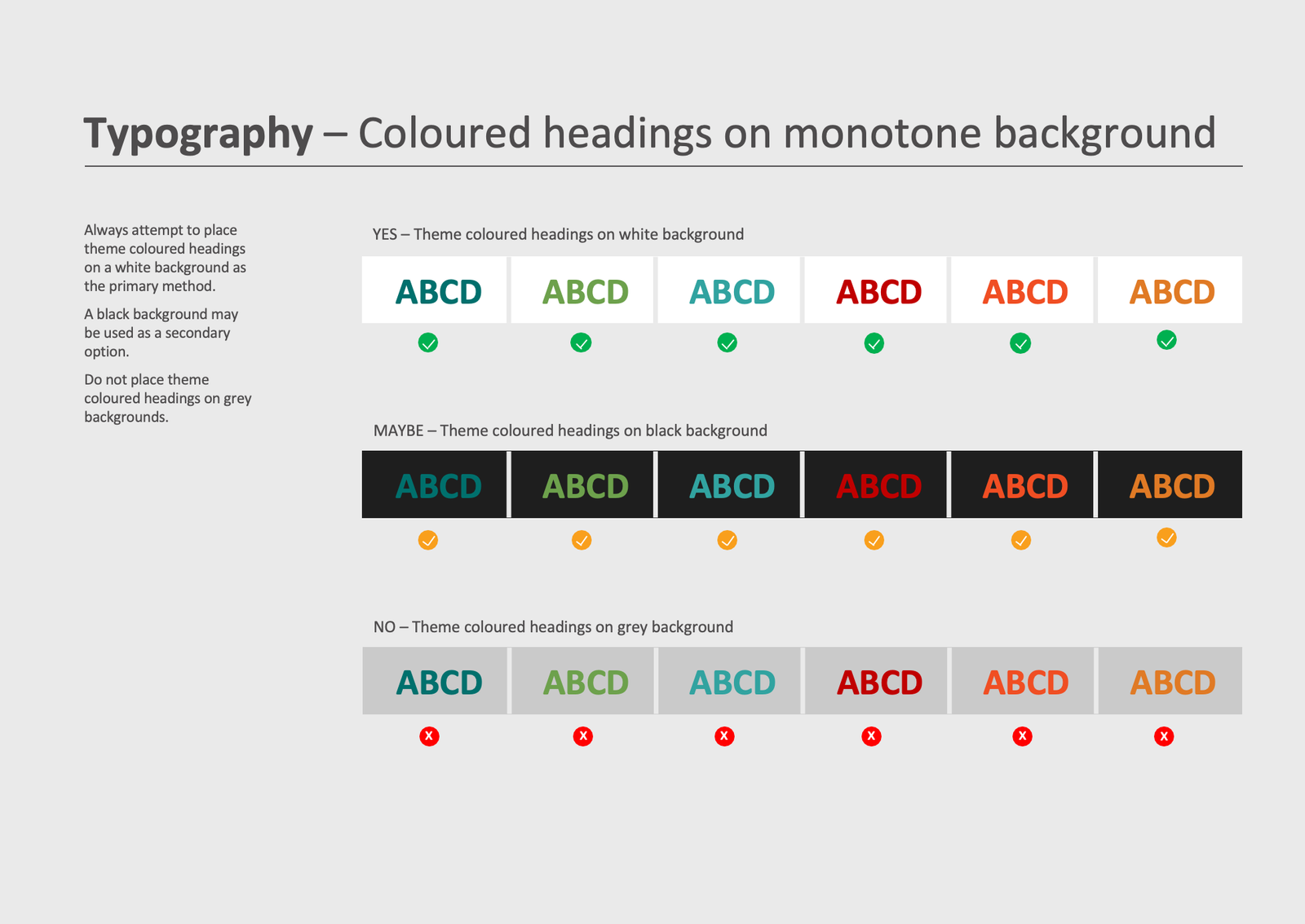
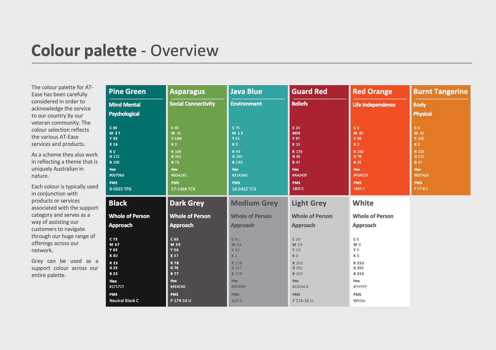
For the existing style guide, I extended the colour palette using colour theory principles, applied the design in new ways, added to the typography section, and defined further details such as around photography usage.
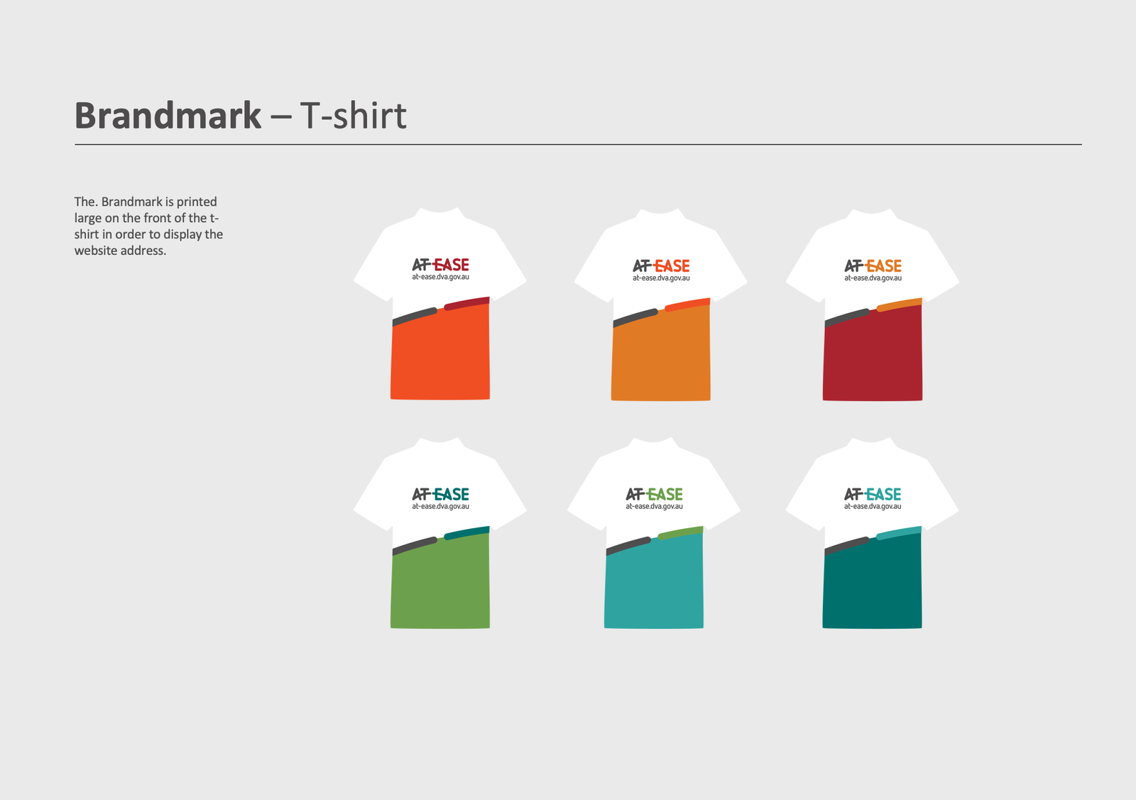
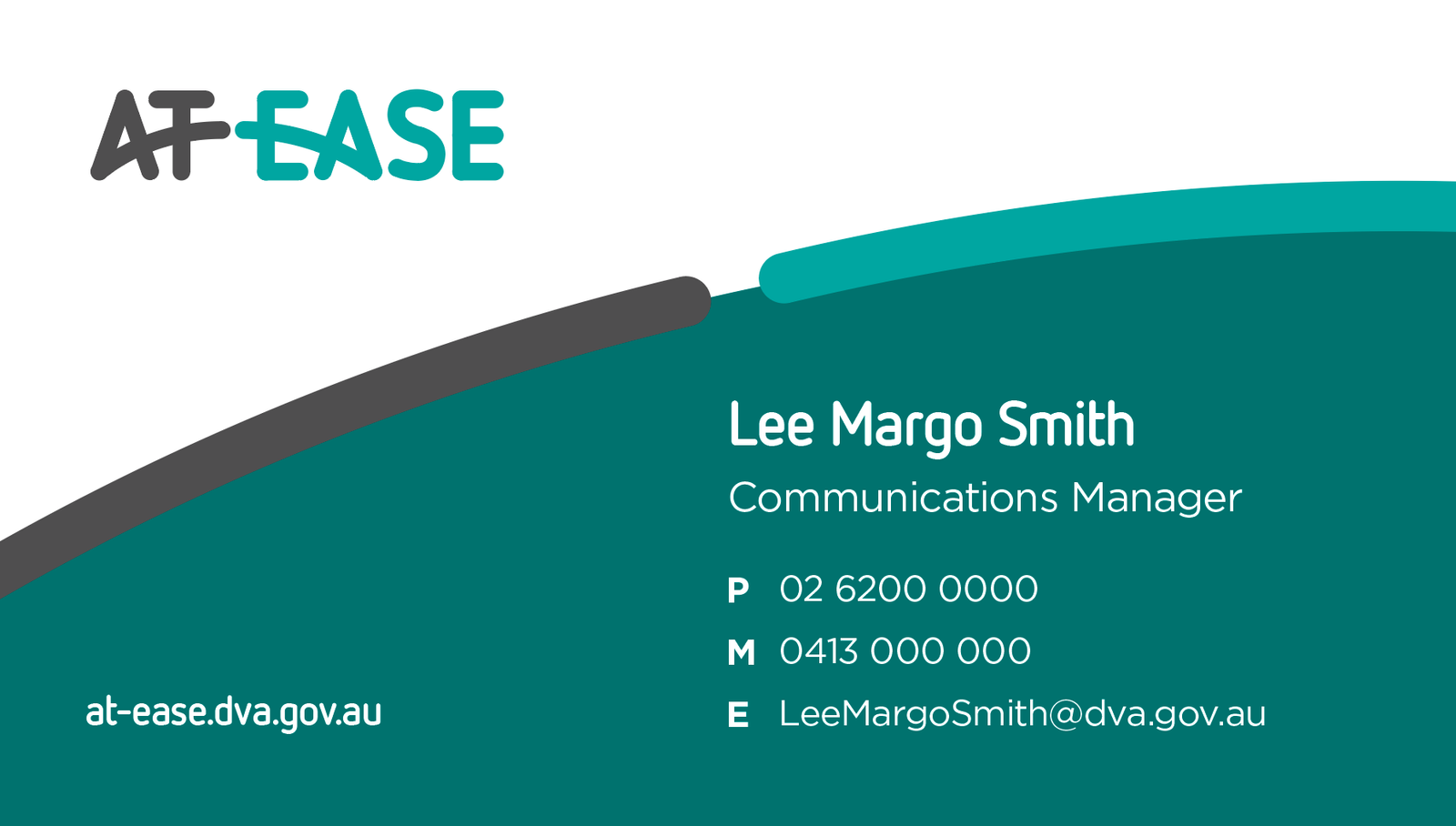
I applied the design to a stationary set which included t-shirts, business cards, ppt slides, letter heads and more.
I applied the Open Arms and At-Ease branding to a series of double sided brochures and brochure covers.
I developed a series of assets including post-cards, email signatures, posters, pull down banners, and fridge magnets.
The print materials were shown and distributed to veterans at open days, and also sent in the mail. This provided veterans with readily available contact details for counselling and support if and when needed.
The digital style guide was able to guide future development of the website as it evolved over time.
This website homepage prototype was conceived during a project to redesign of a number of websites for the Department of Veterans’ Affairs.
The logo was redesigned by an external agency to that shown in the new prototype. All photography throughout the website was kept.
During the design of this page, I adopted the fundamental principles of home page design. The following is a description of those principles.